
Challenge
-
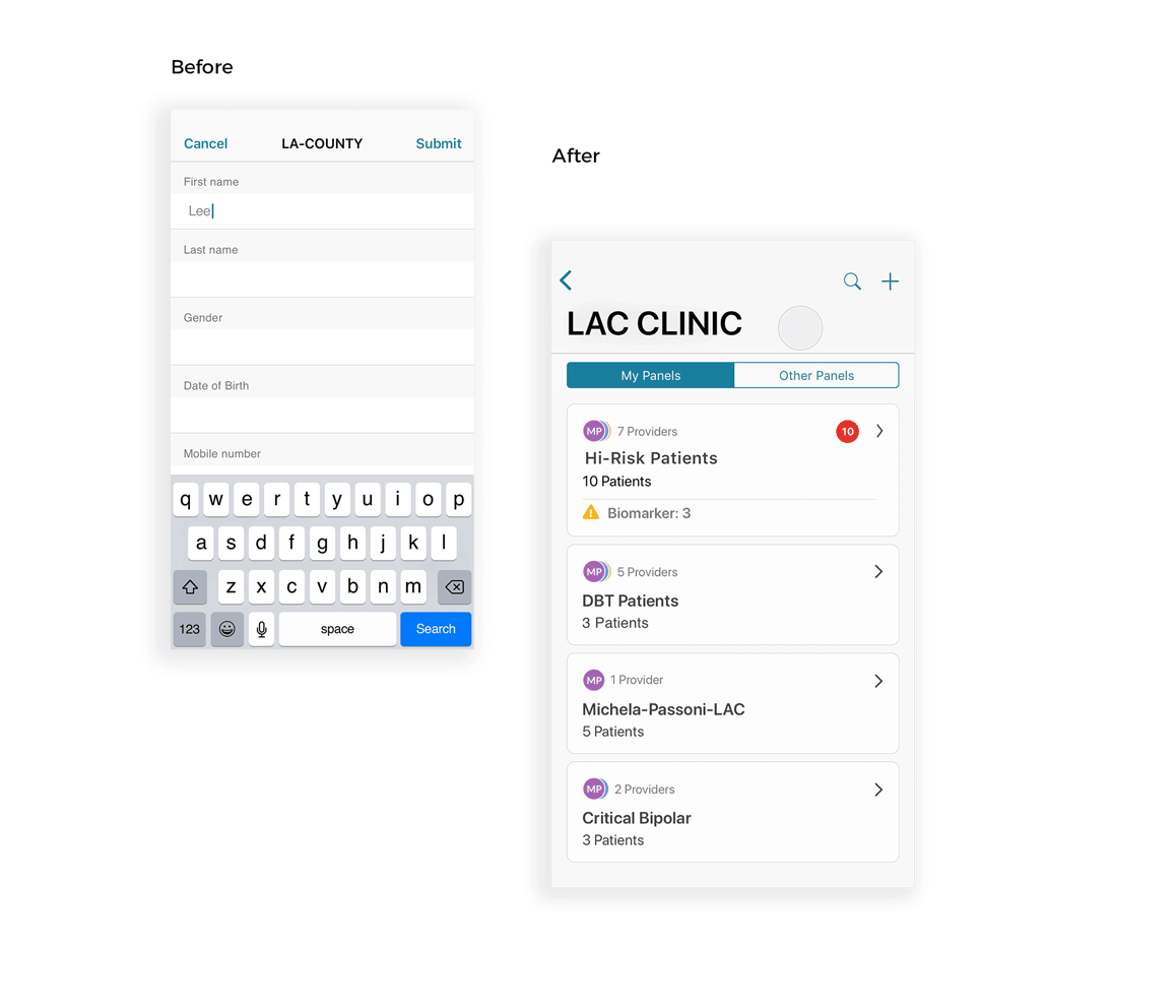
As Mindstrong offers 24/7 mental health support, clinicians need to be on-call all the time. However, they have been lacking an on-the-go solution that allows them to be notified about urgent patient situations and respond to them quickly.
The design team’s task was to create a Care app to allow for mobile access of the patients’ profiles and messaging. My responsibility was to design the navigation and app flow to be as intuitive and efficient as possible.
How should the navigation process within the app work for emergency situations?

Providers need to easily respond to urgent patient messages on-the-go

Understanding user needs
-
Through several interview sessions with clinicians, the major requests and pain points of clinicians were reviewed to create the following summary of user stories.
User stories
As a clinician I want to:
Easily switch between affiliations so that I can see notifications from patients across different affiliations that I am managing.
See all the panels that I'm associated with so that I can quickly and easily respond to patient notifications.
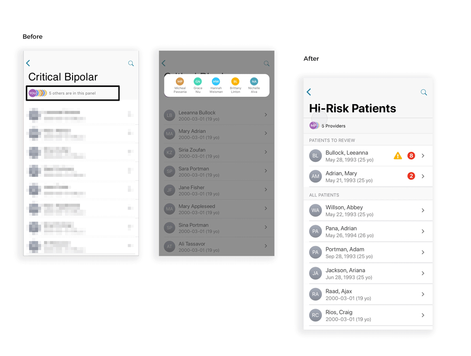
See which clinicians are on a panel so that I know who else is responsible for patient care.
Quickly navigate to a patient message so I can respond easily.
Easily see patients with new messages or biomarker triggers so that I can manage my workflow.
As Mindstrong, I want to prevent clinicians from easily viewing all patients so that privacy is protected.
MVP requirements
-
Based on the user needs, together with the product manager, we created a list of minimum viable product (MVP) requirements:
Speed up crisis management
Allow users to register new patients through mobile app
Enable providers to review other providers’ panels
Provide ease of access to messaging
Show patients’ profile including bio markers, medical details, and notes
Protect the patient privacy information while using the app in public locations
Ideation
-
Whiteboard session and brainstorming
I got together with the rest of the design team and we created multiple concepts for user flows around affiliation/panel index, patient list, search functions, and registration process for new patients through sketching and multiple whiteboard sessions. We started ranking the ideas and selected the concept that could best meet the user needs.

Prototyping & Validation
-
InVision Prototyping
To quickly test our concept, I created mock-ups in Sketch and used InVision to create a functional prototype. I then asked 5 clinicians at Mindstrong to test it and gathered some initial feedback. Based on the inputs, I immediately realized that a few of the most important features within the app such as the search function, registration process for new patients, patients list, and providers list needed improvements.
Key Findings
Search Function:
Searching patients across affiliations was prone to errors
In our first iteration, we enabled the clinicians to search across affiliations so that they have access to a broader list of patients. However, through validation, we noticed this would increase the risk messaging the wrong patient or within the wrong affiliation as a patient maybe part of multiple affiliations. This was an important finding as it might have also led to accidentally sharing sensitive patient info.
Solution: Remove the search feature from the affiliation Index in MVP version of the app

Lack of Optimization in Search Options
We realized that clinicians would not search based on patients’ phone numbers. Also, searching based on patient’s affiliation was confusing for users as it was not clear if the name resulted from the search was associated with My Panels or Other Panels. Lastly, most of the clinicians requested to have quick access to the recent patients they have interacted with in the search bar.
Solution:
Remove search based on phone number
Cluster search results to show which panel each patient belongs to (My Panels vs. Other Panels).
Display the list of recently reviewed patients as soon as user starts typing in a specific name (limit:20 names).

Registration Process Flow:
When registering a new patient, clinicians were unclear if he/she has already been registered before or not.
Solution: Display the closely matched names of previously registered patients in real time as the clinician starts typing in the patients name.
Patient List View:
Poor patient arrangement on the patient list view
We initially made it the default for the patient list to be organized purely based on the number of outstanding patient notifications. However, during the validation, one of the clinicians stated, “although I like how the unread messages and biomarkers notifications are on the top of the list, it would also be good to see them in alphabetical order to facilitate sorting through the list in search of a specific patient.”
Solution: Create a separated list of high risk patients who need immediate attention and organize them in alphabetical order.

Providers List View:
Based initial user stories, we knew that being able to know which other clinicians are in the same panel was a major need. For the first prototype, I created a small horizontal modal to show the list of providers in a panel. However, user feedback during validation testing helped me realize that finding the name of a clinician through horizontal scrolling gets harder as the number of clinicians increase.
Solution:
Limit the number of horizontally displayed icons to 3 if 3 or more providers existed in a panel.
Specify the entire page to display the list of providers in alphabetical order.
Motion Behavior
-


User flow diagram
For Engineering Hand-Off
-

Reflections
-
I had the privilege of being a part of the design team that took the product all the way from concept to execution. As a team we feel that we were successful in developing and implementing the first version of Care Mobile(MVP) to address providers’ immediate needs such as speeding up crisis management, providing an “on the go” messaging solution, and protecting the patient information. That being said, Care Mobile is still in early stages and there is a lot of opportunities ahead for improvements.
Things we need to improve as the next step
Based on the results of the usability testings, we removed the cross-affiliation search and patient registrations to avoid mistakes and sharing sensitive patient info. However, with this implementation, the care provider has to go through the inefficient process of searching in every individual affiliation if he/she cannot remember which affiliation the patient belonged to. Therefore, as a next step, the design team needs to explore alternative solutions that are both efficient and error-free.