Intro
-
Mindstrong offers a technology that measures cognitive and emotional/brain function using patterns generated from your touchscreen interactions such as type, swipe, taps on your smart phones. These measurements that are called “biomarkers”, will be used as an endpoint for clinical trial (e.g. in the early detection of depression).
About Care by Mindstrong
Mindstrong partnered with several affiliations or clinics to offer 24/7 access to mental health support. Through the Care by Mindstrong provider-facing web app, the area that I contributed to the most, providers (internal clinicians) will be alerted if there are any abnormal changes in the biomarkers. This will enable them to contact, assess, and intervene early through Telehealth to avoid an unexpected crisis, hospitalization, and ER admission.


Challenge
-
Mindstrong providers have recently demanded improvements to their internal patient management system. They expressed that having all patients listed in one affiliation causes confusion and is error-prone when needing to identify which patients belong to what providers. Therefore, currently providers have to create alternative spreadsheets to track their own caseload on care.
How might we enable care users to mange their caseload/patients more efficiently?

The current patient list within an affiliation selected

An example of one of the clinician’s google spreadsheet that demonstrate how they manage their own patients outside the Care.
the PRELIMINARY DESIGN OF the care WEB

Design goals:
-Improve the internal patient management system
-Make the triage process easier for providers
-Enabling supervisors to assign patients to specific providers, or teams of providers
-Improve workflow, escalation, and attribution of responsibility
Kick off
-
User journey flow
To begin, I decided to identify all of the various roles at Mindstrong, specifically those who deliver care to patients on a daily basis and discover their workflow, tasks, and interactions. I partnered with another designer to create a high level user journey for each role that is involved from the first day a patient gets notified about Mindstrong until the last day he/she receives service and is completely discharged. The user flows revealed that the main target group I needed to focus on was the care managers or providers team who monitor and interact with patients through the Care web app the most.

user interview & observation
-
In order to better understand the major pain points and dive into more details about how we improve the way the providers manage their patients, I decided to interview some of the clinOps at Mindstrong and observe their work flow.
interview goals
Determine the exact workflow of providers as soon as they log-In to Care
Identify the pain-points that need to be addressed and define them as user needs
Discover the third party tools leveraged by the clinicians to manage their case loads and evaluate if there’s a potential to integrate them into the Care app.


Key findings
Customization deficiency in patient list: Users were not able to organize their own patient list the way they wanted. As the list of patients grew within an affiliation, it became more difficult for the providers to identify their patients by relying on memory. Therefore, they had to create a separate spreadsheet to group their patients based on their enroll date, specific services they get, etc.
“I cannot track my own caseload on current Care. I’ve needed to create an alternative spreadsheet. I am tasked to create a new proposed MHS Spreadsheet, but I have not had a chance to do this yet.”
- Brittany, Care Manager
Lack of ability to access other clinicians’ patients for handing off or supervising other providers workload: This would be useful under specific circumstances when a provider is on vacation and wants to hand-off the patients to another care manger in her/his absence or when a supervisor wants to make sure she/he assigns the patients to the right care providers.
“My job is to oversee the entire patients list within an organization and ensure all the patients are assigned to a provider. It’s really difficult to keep track of who’s working on what patients and the providers who have not responded to a patient message. So I have to do an extra effort and go back and forth to ZenDesk to recall/check who’s responsible on what patients”.
- Grace, Care Managers Supervisor
Organize patients list based on their priority/risk level : The patients list needed to allow sorting based on their urgency.
“I have some patients that need more attention and weekly follow-up because of their illness severity. I wish I could organize them at the top of my list of patients, so that my eyes always see them first.”
- Michela, Care Manager
Missing helpful filtering and sorting features : As Mindstrong’s patients rapidly grew, it became more difficult to keep track of the new enrolled patients. Therefore, some of them might have been neglected and did not get the proper care.
Ideation
-
Then it was time to start sketching and brainstorming. We explored several solutions to accommodate all the user needs and resolve the pain-points.
Tangible Example
As a part of the brainstorming session, we compared the structure of the Care app to how schools are managed as we found many similarities between the two. Different schools were represented by the affiliations/organizations within the app and the patients were the students. So far so good, but then we realized our model was missing the classroom itself, which is in fact the only way to organize students into different categories. In order to fill in the gap of not having classrooms in our app, we created the Panel.


User Scenarios
-
I partnered with our product manager to identify various user scenarios where we can give clinicians more ability to not only organize their own patients through Panels but also to collaborate with other clinicians efficiently.
As a provider I want to be able to do some actions on my patient list such as:
Add or remove:
Patients to/from my panel so that I can control my workflow and know which patients I'm responsible for.
Patients to/from another provider's panel so that I can transfer care of a patient to that person.
Team members (or yourself) so that I can take over the care of another persons group of patients or have control over who is caring for my patients.
View all patients at an affiliation so that I can find a patient whose name I have forgotten or select large groups of patients and change their panel associations.
View other providers’ panels so that I can provide consultant to another clinician regarding his/her patient.
Ensure that there is always one provider associated with every panel so that no patient is missed
new user-flow - IA

Introducing Panels
-


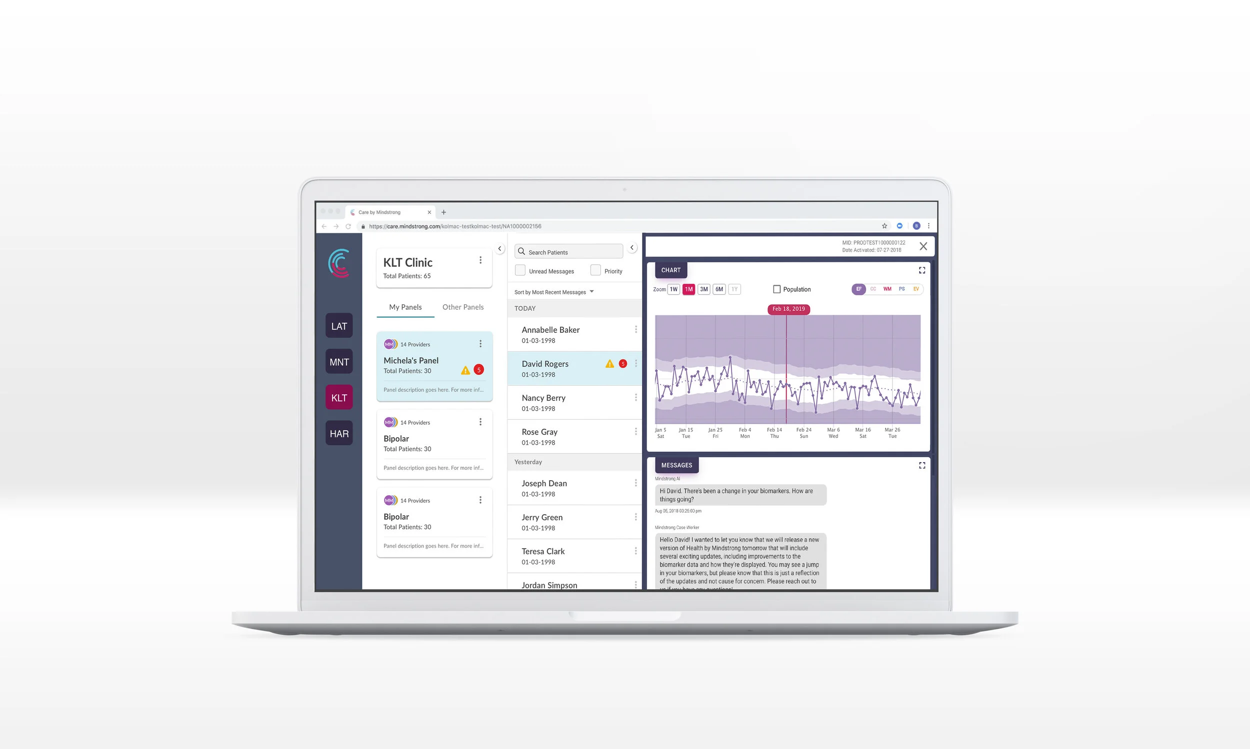
To implement the panels in an easy and efficient way, I decided to use a card-like design that is editable and configurable. Each panel would contain the list of patients (either grouped by provider attribution, patients diagnoses during triage, or patients severity/risk level ), panel description, team members involved within each panel, and the number of unread messages and biomarker or priority status associated with the patients.
Single Panel Anatomy

How to create a panel
We placed the affiliation name at the top of the list of panels and made it configurable so that panels can be created directly from there. By selecting “Create Panel”, providers can enter panel details, select the patients from list of the affiliation, and choose clinicians from the list of Minstrong providers.

Panel Index Features
Made the panel list collapsible to avoid cluttering up the view and help users better focus on their patients list
Made it the default for the panels to be organized based on the urgency of the matter and the number of outstanding tasks associated within each panel (unread messages and priority/biomarker).

Allowed the Care users to easily toggle between “My Panels” and “Other Panels” to make the patients hand-off easier and ensure all clinicians are assigned to the right panel. Clinicians were only allowed to view Other Panels without taking any actions. However, we authorized the supervisors to view and modify other clinicians’ panels.
Patient List Improvements
Made the patient list collapsible to protect PHI in case the clinicians are in public locations
Added a sorting feature to enable care users to sort by the “Most recent messages” and “Date of Activations” (the date the patients got enrolled)


Grouped the patients list by date so that the users can easily find patients they have recently interacted with
Changed the unread messages icon to a red number badge and the priority icon to a yellow exclamation triangle
Allowed the care users to add or remove a patient to or from a panel.
before & after panel implementation


Usability testing & Validation
-
Due to the tight project timelines, we had to postpone the iterations and execution of the final improvements to the next sprint. However, based on the usability testing we conducted, the key findings resulted into the following features:
Customizability: During user testing, users requested to have the ability to rearrange their panels the way they wanted by dragging and dropping them. We also noticed the panels lacked a search feature, so when the user switched to “other panels”, it was hard to find the providers’ base panels amongst numerous others.
Lack of a useful filtering and sorting feature within the patient list: We realized that creating panels for categorizing patients can sometimes be very time consuming. In some cases, providers expressed that they need to be able to flag patients that may need a follow up— the following is a quote from one of the providers:
“The only way for me to sort through my own patients is to create another panel that has high, low, or medium activity. Why should I create three new panels when I could ideally have a filtering system?”
They also pointed out that filtering based on location could be usefull (e.g. Because of the recent shooting in Texas, many of the clinicians decided to have a higher focus on their Texas patients.)
within the next round of iterations, we decided to make the improvements around sorting/filtering options such as location, patient last activity, diagnoses, biomarker activity(sort not only by biomarker status but also by the last time the status was updated).
Reflections
-
It's been a very rewarding experience observing the impact of Panels to the clinicians' daily interactions with their patients. Although, we were not entirely successful to reduce the number of resources/tools the providers leveraged to manage their caseloads, creating Panels partially resolved a few major pain points relating to making their daily workflow more efficient.
Future designs to do
We realized that we need to build a task management infrastructure in place since Panels alone is not a complete solution for enhancing the patient management system and the providers’ daily work flow. In addition, providers’ tasks should not be only limited to responding to messages and checking the status of patients’ biomarkers. The future task management system need to be expanded to incorporate a taxonomy to send reminders, create exercises for patients, assign tasks to providers, schedule follow ups, escalate issues, assign priorities, and more.